Tuesday, 29 June 2010

Magazine Advertisement Analysis

Typical Features of all advertisements;
1) Artists name
2) Album name
3) Website link or email address
4) Background image
5) Band logo if they have one

The Gorillaz Advertisement!
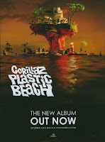
As the album is called 'plastic beach' the font used reflects the name of the album as it looks like it is melting, which could be seen as how hot it is on a beach. Also the name of the band is smaller then the name of the album, which shows that the band is already known and wants their album name to be seen before the name of the band who's album it is. Also the other text that is on the cover is in a more professional that states that it is a 'new' album that's 'out now'. This font and size of it strikes out and attracts the audiences attention which is what the aim of it is. The small writing and website at the bottom also promotes the band as to new fans who are interested in the album may go on the website and the logo at the bottom of the advertisement is seen on all Gorilla's singles and albums, as it is the music company that are connected with them. The sea as a background also reflects the name of the album and gives a tranquil setting to it. The colours of the background and foreground are warm and quiet which again reflects the name of the album and sets the scene to the album.
Lip Sync Task


Friday, 25 June 2010

Screen Grabs of Lip Sync

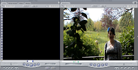
This is the viewer where when i adjusted the video, this is the screen i looked at to see if i liked the way i'd edited it and the effects i used.
This is the tool bar where there are a range of icons where i can adjust the clip i want to edit.
These are the range of clip that i could choose from for my video and edit them together. I could delete the ones that went wrong or i didnt want and ended up with my finished piece from the rest.


These are the video and audio layers that i edited my video on. I could mute the audio of the video clips and edit them into the sound track itself.
This is the full overview of final cut.

Monday, 21 June 2010

Detailed Album Cover Analysis


As this album cover is promoting Girls Aloud's 'Greatest hits' the font is bold and also keeps consistent all the time. The Tambourine could symbolise the words greatest hits as they are instruments that are loud so again could promote the Girls as they are successful in their band. The black squares which are made to look maybe like a dance floor can be seen as a pathway to new and brighter directions for the Girls, as when a band usually releases their greatest hits album, they go on a break and do separate things for their own careers. The five stars are striking out of the album cover, which represent the 5 of the girls. The 'British flag' star could be seen as Cheryl, as to women and teenagers, she is seen as a British icon and the most popular member of the group. Also the orange, white and green star could represent Nadine in the band as she is Irish which again could promote her individually as a person. The girls are not actually on the cover as an image, but silhouette, which proves that they don't necessarily need to promote themselves as they are already known all over Britain. Also the silhouettes are stood in a pose which could attract a male audience as they are stood in a way people will like. The name of the album 'The sound of' is can also be linked with Girls Aloud, as their first single was called ' The Sound Of The Underground' which can signify their progress throughout the bands career and show the progress they have made from their first single. The girls are seen as a POP band, so the bright lights at either side of the silhouettes and the five microphones behind them can link them to the genre of music that they promote as they are objects that are associated with that genre. 

Album Cover Analysis

Michael Jackson is dominating the album cover staring down the lens of the camera. The genre is Pop music, as he is known as the king of POP. His name is bold and metallic down the side of the cover that shows his dominance in the music industry as the black stands out from the white background. He is also dressed in black leather that makes him stand out from the background and shows that he has his own unique style of clothing and fashion. The word ‘Bad’ which is the name of the album is in red which could emphasise that red is a dangerous colour and could also be seen as rebellious as it looks like it has been spray painted on which also could reflect Michael Jackson himself as being rebellious in his own behaviour.


Paulo Nutini is again the dominant image on the album cover. As he is looking away from the camera shows that he could be laughing with someone and which can emphasise that his album is upbeat and quite light hearted. As everything is in black and white and only 'candy' is in colour boldly green emphasises what the album is called as well as that being a name of one of the hit songs on that album. The buildings surrounding him shows that he is a country artist with a calm collective nature to his songs. With him holding a guitar in his hands, we can also see that he is a musician and talented.
On this album cover by 'Girls Aloud' the name of the band strikes out. As it is bold and has a red shadow behind it stands out on the white background which shows that the girls stand out to every other band. As they are seen as a 'pop' band, the the cover has the girls standing with microphones and seen as silhouettes behind their band name promoting their selves. The other writing on the cover, is also bold which makes it stand out and the words 'greatest hits' can be seen as their best songs all on one album.
As Katy Perry is staring straight ahead, she dominates the album cover, but looks innocent and lady like. Her choice of clothing is vintage style which goes with her image she creates for herself, but also could go with the name of the song that she's promoting ' I kissed a girl'. Her name stands out in capital letters on the white background which promotes her as a recording artist as it was her first single. 'I kissed a girl' is also in a quite large font underneath which again is striking out on the white background. But this could contradict her image as being innocent and lady like as the song title is provocative. The image of the lips, also goes with the promoting of the song and stands out as they are bright red and bold which links in with the provocative name of the song.


The name of this rock band dominates the album cover. As the album is called 'Because of the times' the old stone like background fits in well with the name of the album and connects the two together. The colour of the fonts that have been used also can be seen as dirty and old which again reflects the name of the album. As 'Kings of Leon' have been around a while and people know who they are, they don't need a image promoting themselves on the cover as their fans will buy the album whatever the album cover is. The font size is large and emphasises how big the band actually is in the 'rock' world which again shows positive promotion of their album.